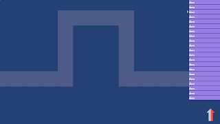
I recently re-styled the challenge levels in Rktcr to have a sort of "sketchy" look. This has been on my TODO list for a while, but was pushed toward the top by comments on the Steam Greenlight page.
In this post, I describe how this style works, and show examples from a new challenge level.
The Basic Idea
The heart of the paper style is a paper height map. To make natural-media-esque strokes, I simply treat the stroke's alpha value as a "pressure", and (soft) threshold this pressure against the paper height.
As the above example strokes show, this gives a nice break up of stroke pigment as the alpha value changes.
As an additional surface roughness cue, I added a pass that performs bump-mapping (with a canonical upper-left light source).
Putting It Together
The style used in the challenge levels is built out of a stack of quite a few layers (as you can see to the right of these pictures). Here's what goes into getting the static platforms looking good. The same methods are used for dynamic and distruptable platforms, but with different textures.
Shadows
The first layer to be drawn is a subtle shadow pass. This helps the platforms "pop" off the background slightly.
Fill
The comes a solid fill color. This isn't broken up by the paper texture, but it will be influenced by the bump-mapping later.
Fill Texture
Next comes a fill texture, as one might see on a blueprint to indicate a solid area. This texture has some ugly hard edges, but the stroke drawn in the next step will cover them up.
Stroke
Finally, a nice natural-media-ish stroke bounds the static platforms. My code insets the stroke so that its top edge pretty much exactly matches where the vehicle actually rests.
Bump-mapping
Finally, lighting is applied to bring out bumps in the paper texture. This completes the look and ties everything together nicely.


Really good looking stuff!
ReplyDelete