1. icon for News
  2. icon for TCHOW

News

Wednesday, April 24, 2013

Making The Worst Case Less Ugly

Nearly everything you see in Rktcr -- sprites, fonts, backgrounds -- is vector-based. Sprites begin life as marked-up SVGs, and are meshed by some tricky planar-map code, then stored as triangle lists; fonts are the same (as I posted about previously); and backgrounds are procedurally generated meshes.

What this means is that without some decent antialiasing or a high-resolution screen, things can go horribly wrong -- lots of jaggies and illegible fonts. My solution to this problem was to add code that "bakes" meshes to textures (this code is only used when antialiasing isn't available). It isn't perfect, but it does make 800x600 a more pleasant playable resolution.

The Results (menu)

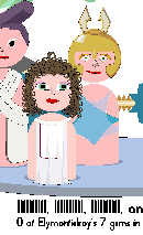
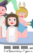
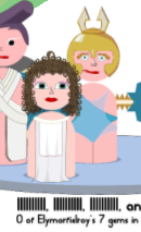
The left image has 16-sample antialiasing; this is how the game is meant to look. In the center, I show what the game looks like with meshes baked to textures -- it's a bit muddier, but still decent. On the right, I show what the game looks like without baking or antialiasing; pretty horrible.

The Results (lab)

You'll probably need to click on these images to see them large enough to judge the differences. The order is aa, baked meshes, no baking, as in the previous comparison. Some interface elements are not static meshes (e.g. the timer in the upper left) and -- as such -- remain jagged.

Thursday, April 18, 2013

The Fonts of Rktcr

This week, I've been working on refining the Rktcr experience in anticipation of a public demo. Particularly, I've been working on redoing the tutorial.

The old tutorial (above) was nice looking, but it's also a static .svg, which means that it's non-interactive, presents a lot of information at once, and includes keys that may not be current.

The new tutorial is visually simpler, you get to test out concepts as they are introduced, and the keys mentioned are actually the controls you've configured.

Part of what I had to do in order to make the new tutorial possible was add a new font to the game -- which got me thinking I might as well do a post about fonts in Rktcr.

The Font System

The basic unit of a font in Rktcr is the glyph. Glyphs contain information about their graphical representation, along with a table that indicates how to advance the cursor for subsequent glyphs.

Glyphs can represent arbitrary strings of characters; this allows for complicated ligatures. When typesetting text, the longest prefix of the string that corresponds to a glyph is used. In theory, this should also allow the code to support UTF8 without extra decode steps, but in practice I chose to explicitly decode UTF8 in a preprocess (mostly as a way of catching malformed strings).

Rktcr loads fonts from specially-tagged .svg files. Any group labeled as "font:xyz" creates a glyph for the character sequence "xyz", and groups labled as "adv:" specify cursor advances between glyphs. This makes it relatively easy to create new fonts in Inkscape. (I don't use the official SVG font specification because... well, I didn't know about it.)

The Fonts

I've drawn five fonts for Rktcr so far, though only two of them appear in the game at present.

Blank Check

Blank Check is the main Rktcr font. It attempts to capture the graphical ethos of the game: it has the classic presence of a pixel font, with a love of circles only a pure-vector system could espouse. It isn't the smoothest-reading font, but it brings a certain naivete and optimism (which I share) to the table.

Control

Control is the font I use for representing keyboard keys. It makes use of ligatures for keys like "space" and "escape". Its corner-cut design is based on some very early concept art. Like other fonts in the game, it is incomplete (but complete enough to be useful).

Madness

Madness is a serif-font experiment I started around the same time as Blank Check. It doesn't appear in the game (but what a different game it would be if it did!).

Rktcr

Rktcr is the first font I slapped together for the game; turns out to be painful to read, so I took it out. It does have a nice ligature for "rktcr", though I decided to move away from that style for the title.

Temporal

Temporal is a simple 7-seg digit font that used to be used for times. It was supplanted by a set of dot-matrix-style digit sprites (for the path computer) and blank check (everywhere else).
Friday, April 12, 2013

Rktcr Beta4: Bursts and Bobs

This weekend, I'm pleased to be able to unleash Rktcr beta4 upon the world. It's not jam-packed with dramatic new improvements, but it does contain a few important refinements (enough of which have potential to break on Intel GPUs) that I figured it was worth sending out a new build.

This beta build also includes the challenge level style improvements that I talked about in a previous post. (Indeed, these are one of the main GPU-worry-causing improvements.)

By the way, if you'd like to be playing the beta, drop me an e-mail and I'll get you a Desura key.

Gameplay Refinements

This build contains two graphical tweaks that make the game more "readable".

Indicator triangles show which of the control keys are pressed, even when the game is paused. This creates a strong visual connection with your control inputs.

The play-pause indicator now lives at the bottom center of the screen, and has shadows that show the current speed that the time-forward and time-backward keys will reach. This position feels more sensible, given how essential to the game time control is.

Burst Graphics and Sounds

Bursts were one of the last remaining items in the game without at least a first-pass visual style applied to them. Well, this is no longer the case. I've also updated the burst collision and activation sounds to a sizzle and a sizzle-y pop, respectively.

More Levels

I've added two new world levels. And, thanks to the extra connections these levels afford, I've been able to generate clover-free worlds (if you have been playing the beta, you probably know what this means).

I've also added four more challenge levels -- these all go in the middle filing cabinet.

Miscellaneous

Sometimes you do amazing things and want to show them off. Pressing 'v' will replay your path in the current zone; pressing shift-v will replay your entire journey. During the replay you can change the speed of time and move the camera. I'm looking into what it would take to encode and upload to youtube from within the game.

Loading has gotten dramatically faster -- at least on my SSD-containing dev boxes. For instance, it used to take 20 seconds to load all the in-game sprites; it now takes 88 milliseconds.

Wednesday, April 10, 2013

Blueprint-style Challenges in Rktcr

I recently re-styled the challenge levels in Rktcr to have a sort of "sketchy" look. This has been on my TODO list for a while, but was pushed toward the top by comments on the Steam Greenlight page.

In this post, I describe how this style works, and show examples from a new challenge level.

The Basic Idea

The heart of the paper style is a paper height map. To make natural-media-esque strokes, I simply treat the stroke's alpha value as a "pressure", and (soft) threshold this pressure against the paper height.

As the above example strokes show, this gives a nice break up of stroke pigment as the alpha value changes.

As an additional surface roughness cue, I added a pass that performs bump-mapping (with a canonical upper-left light source).

Putting It Together

The style used in the challenge levels is built out of a stack of quite a few layers (as you can see to the right of these pictures). Here's what goes into getting the static platforms looking good. The same methods are used for dynamic and distruptable platforms, but with different textures.

Shadows

The first layer to be drawn is a subtle shadow pass. This helps the platforms "pop" off the background slightly.

Fill

The comes a solid fill color. This isn't broken up by the paper texture, but it will be influenced by the bump-mapping later.

Fill Texture

Next comes a fill texture, as one might see on a blueprint to indicate a solid area. This texture has some ugly hard edges, but the stroke drawn in the next step will cover them up.

Stroke

Finally, a nice natural-media-ish stroke bounds the static platforms. My code insets the stroke so that its top edge pretty much exactly matches where the vehicle actually rests.

Bump-mapping

Finally, lighting is applied to bring out bumps in the paper texture. This completes the look and ties everything together nicely.

Saturday, April 6, 2013

This is what winning Rktcr looks like

In Rktcr, you win by directing the vehicle through the world to collect 14 gems and return home. You get a lot of tools to help you do this quickly and elegantly -- time control means that you never have to live with mistakes (and can make split-second decisions over multiple seconds); path select allows you to re-use segments of the journey you've already perfected; and the paths computer can tell you the optimal route to victory.

Here's what one of those meticulously created journeys looks like when you watch it in real-time:

Note that I've skipped all the cutscenes here except for the game-winning one. Also, the character names are random combinations of the pipe and lowercase-l characters (which appear identical), because I don't want to provide any suggestions as to what characters should be named.

Friday, March 29, 2013

Rktcr: Beta3 and the Paths Computer

I am discovering that deciding when to release a beta of Rktcr is all about balancing imperfections. There are the rough edges I know about -- e.g. the missing lab functions in previous betas, or the relatively thin writing in the scripts -- and the imperfections that my testers invariably find -- e.g. blank screens and crashes on Intel GPUs.

The first kind of imperfection slows me down -- makes me want to take longer between betas so I can add "just one more thing." But the existence of the second kind of imperfection pushes in the other direction. Adding many new features and then finding a bug gives one a much larger amount of code to review.

I'm releasing Beta3 because of both kinds of imperfection. I've added a significant new feature -- the paths computer -- and I think I've worked around or solved a few antialiasing bugs I introduced in Beta2.

The Paths Computer

If you are one of the lucky(?) few who have been playing Rktcr, you know that the world can be confusing. Infuriating even. The connections between zones are complicated, and the game doesn't provide a map. To be clear:

This is by design.

(And that's why the paths computer is off by default.)

However, if you want to give up on thinking for a while, you can turn that 'ol beast on and it will act like a GPS -- pointing you to the fastest path it knows of that wins the game. It draws on both the par times built into the levels and on any paths you've completed with the current team.

More Level Styling

It's getting to that point where I want to convince people that Rktcr is an interesting game. Which -- in part -- means prettying up the levels a bit. This beta includes a first pass on that styling, with a low-key green geode style going into all previously unstyled passage levels, and a (actually rather ugly) draft of a blueprint-y style going onto the challenge levels.

Planar Map Refinements

I wrote some planar map code a while back to help in translating SVGs (with their attendant annoying fill rules) into nice OpenGL-drawable meshes. I ended up working with integer coordinates in the map code because it makes things like exact line-side tests a heck of a lot more feasible.

Unfortunately, the kind of detail I was putting into sprites was running up against precision problems, leading to some jagged edges on small features. So I revisited the code and pushed my hacks just as far as I could. I think the results are good; however, sprites have about 40% higher polycount than before. Almost certainly something I will need to revisit ... again.

Friday, March 22, 2013

Rktcr: Beta2

Rktcr beta2 has been released to testers. Along with the improvements to path select mode and the additional costumes that I mentioned in my last post, this beta brings several changes (big and small) to rktcr.

I highlight the big visual changes below. One big change that isn't so easy to screenshot is that I've revised the controls. It used to be the case that one could either play with explicit time control (with keys to play/rewind) or with constantly-running time (with keys to adjust speed). Feedback from my testers (thanks folks!) indicates that nobody plays the second way; so I've removed continuously flowing time (I keep the keys, but now they adjust a speed multiplier for play/rewind). This means that -- for the first time ever -- you can rewind in slow motion; this is actually more useful than it would initially seem.

Memories Board

One of the most visible changes in this beta is the addition of the memories board. This notice board has scraps of paper posted for every cutscene you've seen, and allows you to re-watch them. It's not a core gameplay feature, but it's nice to have.

New Challenge Levels

I created four new medium-difficulty challenge levels "ledge", "bound", "levitate", and "checks." They aren't terribly devious, but they are certainly fun to figure out.

Gem Adjustments

Gems now draw in a sparkly way, have their final mineral names, and make a "ting" sound when picked up. Actually styling them based on their minerals remains for the next release.