1. icon for News
  2. icon for TCHOW

News

Showing posts with label art. Show all posts

Tuesday, January 14, 2014

Iterating on Promo Art for Rainbow

Rainbow for iOS (and for Android!) will be out tomorrow, and as part of the assets for the Google Play store, I needed to design a large (1024x500) promotional image for the game.

As you can see above, I arrived at an pretty good image. I think it captures the essence of Rainbow's art style and gameplay, while striking a balance between cleanliness and boredom.

Arriving at this image required a few iterations. My first mockups had a hand-drawn rainbow that just didn't seem lively enough:

I tried patching in some spirals, but they still didn't look right to me. Perhaps this is because I'm over-familiar with the way cubic splines look (and/or the way rainbows actually move in the game):

So I ended up hacking in a special game mode that uses a white background and hides the level while taking screenshots; and repeatedly played through a simple (splitter-only) level to come up with some rainbow patterns. This turns out to be somewhat difficult.

This was good as a first cut, but too busy. After trimming a few of the characters from the bottom of the image, and playing through my empty level several more times, I arrived at the final version:

I also needed a smaller version of the image with a slightly different aspect ratio (180x120). For this I re-arranged the TCHOW logo to above the word "Rainbow" and strengthened the halo to make the letters more readable:

The final promo and small promo images -- along with high-res versions of other game assets -- can be obtained from the Rainbow Press Kit.

Wednesday, November 13, 2013

Math: What is the right Aspect Ratio?

In the shower the other day, I thought up an interesting question: what is the right aspect ratio to work in? (With, of course, the immediate follow-up question: what does "right" mean in this context?) In this post, I'll attempt to answer both questions with some simple math.

Setup

I've been doing some pre-production work on a storybook game for iOS devices. The game will likely be composed of full-screen scenes with hand-drawn background plates. I don't want to have require new background plates for every resolution (much less aspect ratio), so the plan is to create one background and fit it to the screen.

So, depending on the screen aspect ratio (in this case: 4:3 on the left, 16:9 on the right), some of the image will be cropped, either off the sides or off the top and bottom.

Minimizing Waste

Since I'm not of a mind to have something drawn that isn't needed, one possible definition of "right" aspect ratio is the one that minimizes wasted area in the background image. So how much area is wasted?

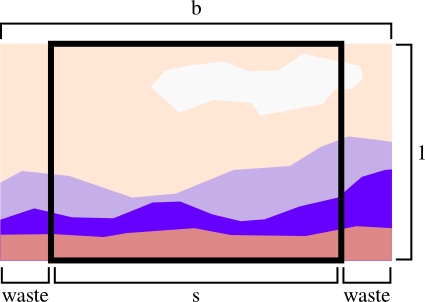
Well, denoting the aspect ratio of the screen s and the aspect ratio of the background image b, and -- without loss of generality -- assuming the screen height is 1, it is easy to draw a picture of the situation:

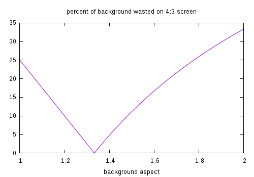
So, if the background is wider than the screen, the percentage of the background image wasted is (b-s) / b. Similarly, when the background is narrower, the waste is (1/b-s) / (1/b).

As expected, on a 4:3 screen a background image of aspect ratio 4:3 wastes the least.

Of course, on iOS one needs to worry about three aspect ratios: 4:3 [iPad], 3:2 [iPhone <= 4], and 71:40 [iPhone >= 5]. (In case you are wondering, 71:40 is 'nearly 16:9'.):

NOTE: I'm only considering landscape aspect ratios because that's the target for this game.

Assuming one wants to give equal weight to background waste on each device, the proper aspect ratio of the background image should minimize the sum of these three curves.

This minimization happens at the 3:2 aspect ratio. Indeed, my intuition is that with equally-weighted devices the minimum-waste aspect ratio will always be the median aspect ratio.

Maximizing Excitement

In the previous section, I counted areas of the background for each time they were cropped -- that is, background that didn't show at 4:3 and at 3:2 was counted as being twice as bad as background that was only cropped at 3:2. Perhaps, instead of obsessing over these lost pixels, one should instead maximize the percentage of the background that is cropped by no device (i.e. the part of the background every screen sees).

What is this percentage? Consider a background of size bx1 to be shown on screens of aspect s1, ..., sN. The width of the visible-on-all-screens region is w = min(b, s1, ..., sN), because the background will be cropped after its aspect exceeds the smallest screen aspect. The height of the visible region is h = min(1, b / s1, ..., b / sN), because of cropping on the top and bottom of edge of the background when it is scaled to the widest aspect ratio. (More intuition: consider scaling the visible region to [horizontally] fit a screen of size sx1. The scale factor is s / b, so it must be the case that h * s / b <= 1; thus h <= b / s.)

Putting these figures together gives percentage 100 * min(b, s1, ..., sN) * min(1, b / s1, ..., b / sN) / (b * 1). Interestingly, this means that maximizing visible area only depends on the narrowest and widest aspect ratio under consideration:

The unfortunate news is that with aspect ratios of 4:3 and 71:40 in the mix there isn't any background size that doesn't end up with about 25% of its area not visible on all screens. The fortunate news is that the best aspect ratio in terms of waste (3:2) is within this 75%-used plateau.

Going Further

In this article I didn't talk at all about foreground content (which must be scaled to fit within each aspect ratio), and only explored two objective functions. Other interesting objective functions might include one weighted for all browser sizes, or one that is concerned with fairness (forcing all screens to lose about the same area of the background).

If you have other ideas, feel free to leave a comment or send an e-mail.

Friday, October 4, 2013

Rktcr's Limited Edition

From October 7th-10th, Rktcr was on pay-what-you-want sale at Indie Game Stand, with 10% of proceeds supporting the EFF. Paying more than average would have netted you an exclusive level pack and a custom digital wallpaper. But that's not what this post is about.

Paying the most would have gotten you one of the only two limited edition physical copies of the game. And these things are amazing. And that is what this post is about.

Each one is an obsessively-crafted testament to my deep love for Rktcr, and feature (from outside to inside):

A paper "Rktcr"-logo band, made from five interleaved sheets, hand-cut and painstakingly assembled.

A Rktcr sprite print box. Each of the four patterns used on these two boxes and their lids are unique and will never appear elsewhere.

A hand-made velvet/foam cushion to showcase...

...a USB drive filled with Rktcr v3.1 and covered in 23K gold leaf, ...

...with a silver-plated chain tassel.

These two limited edition copies are truly amazing things. They, in as non-creepy a sense as possible, reify my deep love for Rktcr, my desire to see it perfected, and my joy at finishing the game. The whole assemblage has a nice weight in the hand, and the drive and chain feel luxurious as you manipulate them.

Thursday, August 22, 2013

Rktcr Wallpapers and Posters

I've been spending most of my Rktcr-related time over the last few days sending out free copies to reviewers and lets-players. This is actually quite time-consuming, since I'm writing a new blurb for each person. I know it would be simpler to copy-paste, but it seems only fair that if they are going to invest the time to check out the game, I should invest the time to write something for just them.

However, I have put a little time into making cool assemblages of Rktcr sprites. These might work well as posters or desktop wallpapers (though they are perhaps a bit busy for a desktop with icons). Regardless, I like the way they look.

I can make these in pretty much any aspect ratio and resolution, so if you would like a custom size, let me know via e-mail or comment.

Posters

These were designed for 11x17 (top row) or 8.5x11 (bottom row) paper. Feel free to download and print.

Wallpapers

I included some dark variants for the desktop wallpapers because, well, you never know.

Wednesday, July 10, 2013

Rktcouture

I spent today drawing costumes for the characters in Rktcr. There are finally 14 for each character, which is the target count I, somewhat arbitrarily, selected.

As you can see, there are some duplicates with more or less variation among them, some recolorings, and a few wild and crazy outfits for each character. I'm unsure if these are going to be the final costumes or if I will refine or replace some of them. However, just as with a piece of writing, it's good to have a real draft to work from instead of a blank page.

Sunday, December 2, 2012

Album-a-Day

In the past less-than-twenty-four hours, we -- @chrisamaphone, @xwjl, @1x, and @dwrensha -- worked together to create an album, which we present here, to you, in all its glory.

"Terrible Ideas ... and BEYOND: A Children's Story"

by Cumbersome Four Calipers

  1. Mystery Can
  2. Wafflespace
  3. Gravity Slide
  4. Break It Down (Build It Up)
  5. Reflections on How Far We've Come
  6. Lambrijolieo
  7. Backup Track (Dance)
  8. Space Chase
  9. The March of Progress
  10. Death (or: Vegetables)
  11. Lambrijolieo (Reprise)
  12. Home Again

Saturday, September 22, 2012

Documented ExitSign

exit sign router

I added a few pictures of my old wireless router, ExitSign, to the funishings page. I took these pictures today just a few minutes before carrying the router to the trash. (Though, as with other modified computing devices past, I saved the front panel as a memorial.)

Therein lies the crucial problem with decorating electronics: they do not age gracefully.

Sunday, November 23, 2008

Added Blots

I added blots, an old animation project, to the art section.